
We all see logos every day. They’re on the front of our favorite products, plastered on billboards, and stitched onto our clothes. But have you ever stopped to think about what they really mean? Many logos are designed with hidden meanings that go beyond their literal interpretation. In some cases, these hidden meanings are intentional, while in others they are the result of clever design. Here the famous logo with hidden meaning that worth taking a second look at.
Here are 26 logos with hidden meanings that will make you look twice:
1. FedEx
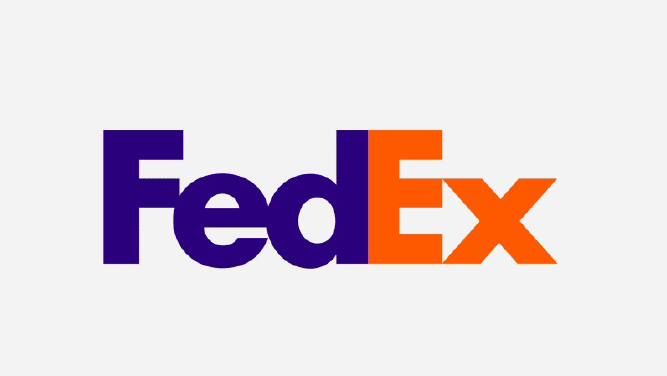
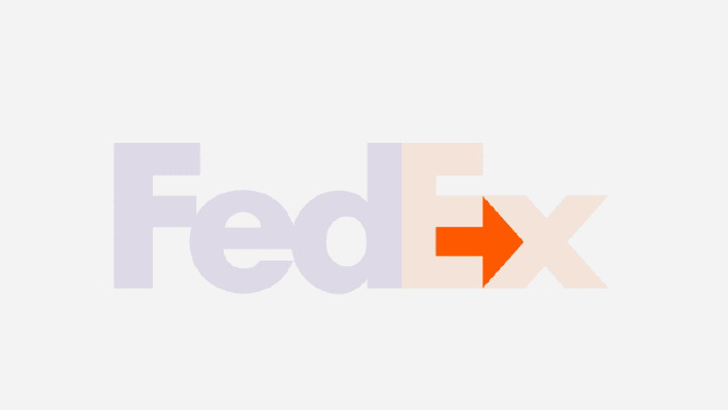
The FedEx logo is one of the most cleverly designed logos in existence. If you look closely, you’ll notice that the negative space between the E and the X forms an arrow. This arrow symbolizes the company’s speed and efficiency.
2. Amazon
The Amazon logo is also quite clever. The yellow arrow that starts at the a and ends at the z symbolizes the company’s wide selection of products. It also doubles as a smile, representing the company’s customer-centric philosophy.
3. Baskin-Robbins
The Baskin-Robbins logo contains a hidden message that becomes apparent when the logo is turned upside down. The message, “31 flavors,” is a reference to the company’s original 31 flavors of ice cream.
4. Toblerone
The Toblerone logo contains a hidden bear. This is a reference to the city of Bern, Switzerland, where the company is headquartered. The bear is also the city’s official mascot.
5. Nike
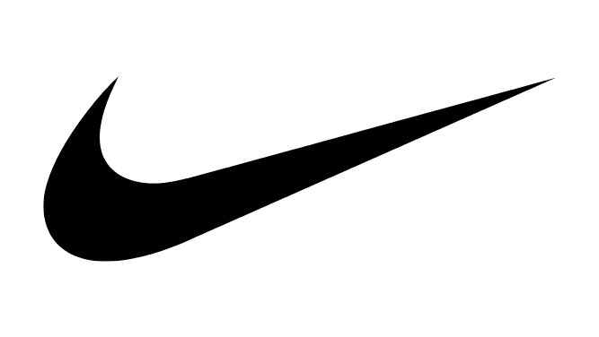
The Nike swoosh is one of the most recognizable logos in the world. But did you know that it was actually inspired by the wing of a Greek goddess? The goddess in question is Nike, the goddess of victory.
6. Hyundai
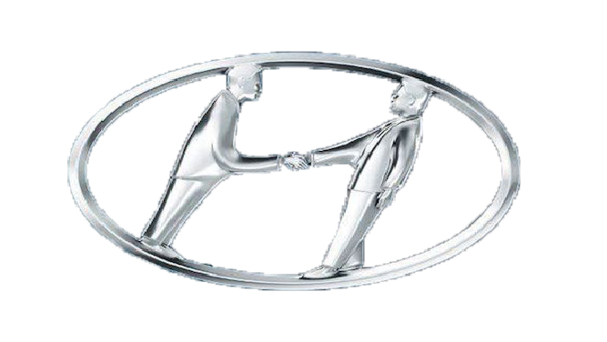
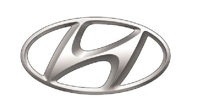
The Hyundai logo is a simple one, but it contains a hidden meaning. The two “H”s in the logo actually form the shape of a human figure. This is meant to represent the company’s commitment to human-centered design.
7. BMW
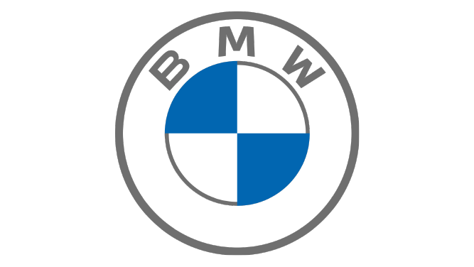
The BMW logo is another one with a hidden meaning. The blue and white colors of the logo are a reference to the German flag. The logo also contains a hidden propeller, symbolizing the company’s aviation history.
8. Toyota
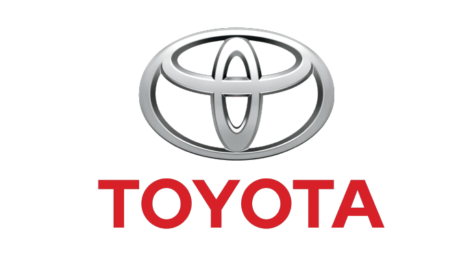
The Toyota logo is a simple one, but it contains a hidden meaning. The three overlapping circles in the logo represent the company’s commitment to the global market.
9. LG
The LG logo is a simple one, but it contains a hidden meaning. The two “L”s in the logo actually form the shape of a human face. This is meant to represent the company’s focus on human-centered design.
10. Coca-Cola
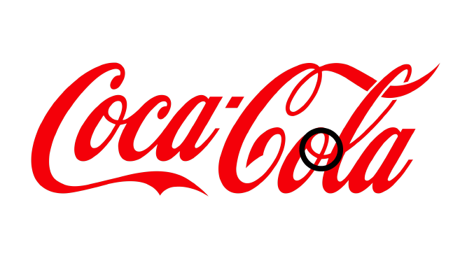
The Coca-Cola logo is one of the most recognizable in the world. But did you know that it contains a hidden message? The space between the “O” and the “L” forms the shape of a cross. This is a reference to the company’s Christian values.
11. Pepsi
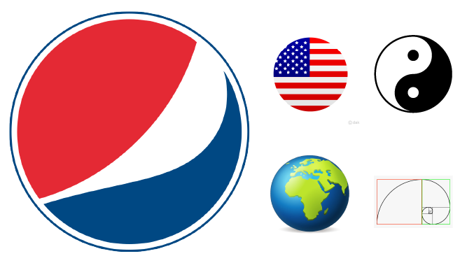
The Pepsi logo is another one with a hidden message. The three-part design, with a blue bottom and red top, divided by a wavy white line, symbolises the American flag but also has additional connotations. The golden ratio, feng shui, Pythagorean geodynamics, the theory of relativity, and the earth’s magnetic field are all intended to be represented by the colours. How much does Pepsi logo cost? Check it here.
12. Adidas
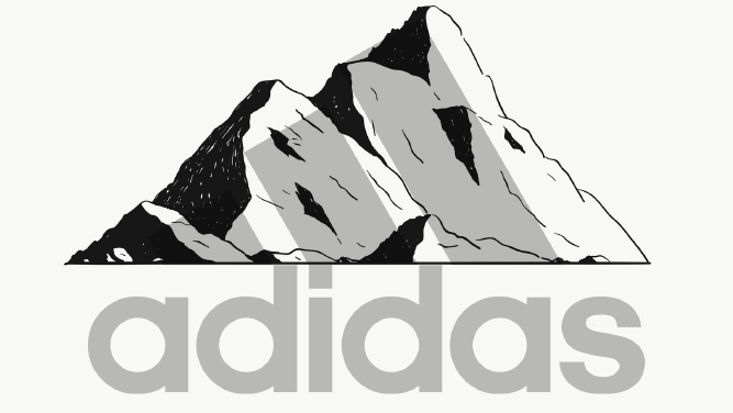
The Adidas is a well-known manufacturer of shoes and sportswear. Their logo has traditionally had three stripes, but in their most recent makeover, the stripes are spaced out to resemble a mountain. The mountain is a metaphor for the difficulties and impediments that competitors must encounter and conquer.
13. Beats by Dre
The Beats by Dre logo is a simple one, but it contains a hidden meaning. The brand name is placed after the enclosed letter “b.” The circle, however, is more than simply that. In reality, it symbolises a human head, and the letterform “b” stands for the company’s headphones.
14. Carrefour
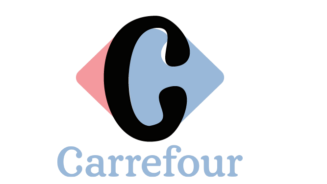
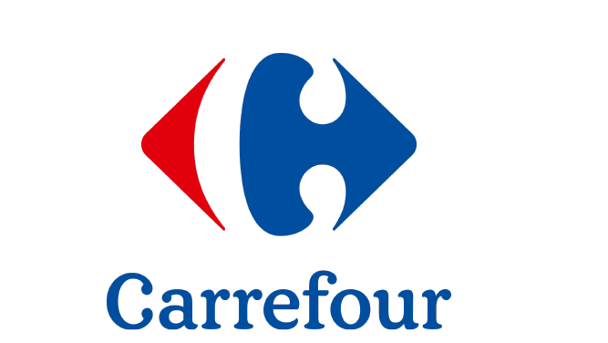
This French grocery chain’s name translates as “crossroads” in English, and its emblem is made up of two arrows pointing in different directions. You may also see the letter C in the logo’s empty area if you pay close attention.
15. Google
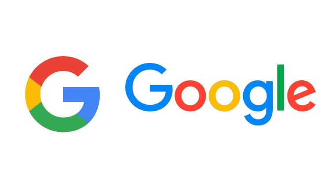
The Google logo is a simple one, but it contains a hidden meaning. Google’s logo, which is also very recognised throughout the globe (even with their latest revamp), is meant to represent the company’s attitude of breaking the rules and having a good time. Instead of using a bizarre typeface or symbol, they opted to use colour to convey their message. They continued to use a primary colour scheme but added the secondary colour green to break it.
16. VAIO

The abstract logo for this Sony computer brand was smart, but the casual observer would probably not get the allusion. The letters “V” and “A” combined stand for an analogue wave, whereas “I” and “O” suggest a digital signal (through the binary numbers 1 and 0). One more illustration of a logo with hidden meanings.
17. Continental
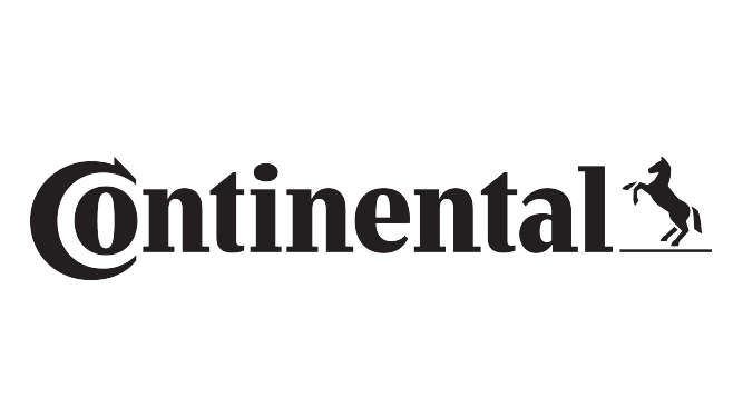
There is a covert image in the Continental tyre firm. Do you see it? Take a careful look at the C. Tire, that is.
18. Cisco
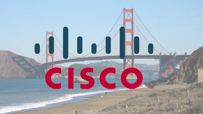
There is a secret picture in the Cisco logo. The Golden Gate Bridge in San Francisco is depicted by the black lines above the photograph.
19. Sony Ericsson
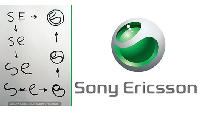
There is more to the Sony Ericsson logo than meets the eye. At first glance, the logo appears to be a simple combination of the letters ‘S’ and ‘E’, but upon closer inspection, there is a hidden meaning behind the logo. The two letters actually form the shape of a butterfly, which is a symbol of transformation and change. This hidden meaning is in line with the company’s brand identity, which is all about innovation and making positive change in the world. The hidden meaning behind the logo is a reflection of the company’s commitment to making positive change in the world. Sony Ericsson is a leading innovator in the mobile phone industry, and the company is constantly striving to push the boundaries of what is possible. The hidden butterfly symbol in the logo is a representation of this commitment to change and innovation. When you take a closer look at the Sony Ericsson logo, you can see that the two letters ‘S’ and ‘E’ form the shape of a butterfly. This hidden meaning is in line with the company’s brand identity, which is all about innovation and making positive change in the world. The hidden butterfly symbol in the logo is a representation of this commitment to change and innovation.
20. Volkswagen
The Volkswagen logo is a simple one, but it contains a hidden meaning. The space between the “V” and the “W” forms the shape of a people. This is a reference to the company’s origins as a people’s car.
21. Hope for African Children Initiative
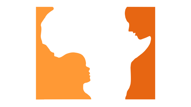
This logo first looks to be nothing more than the continent of Africa’s shape. You can see that this shape is actually made up of the curves of two different people—an adult and a child—if you look more closely.
22. Pinterest
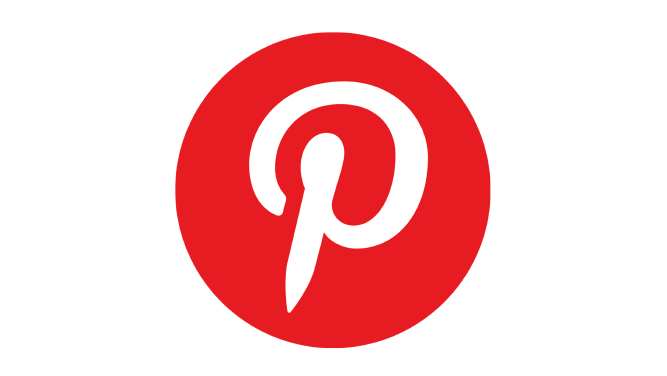
The concept of “pinning” items you like to a board is where the word “Pinterest” comes from. The “P” stands for a pushpin to extend the concept of the pin. This combines the physical component of taping things to your wall with doing it in the modern world.
23. Apple
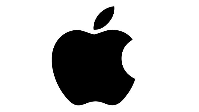
The Apple emblem, one of the most famous in the world, is thought to have originated from the tale of Adam and Eve. The apple is meant to represent the fruits from the Tree of Knowledge and is claimed to be the apple Eve mentioned in the Bible.
24. Domino’s
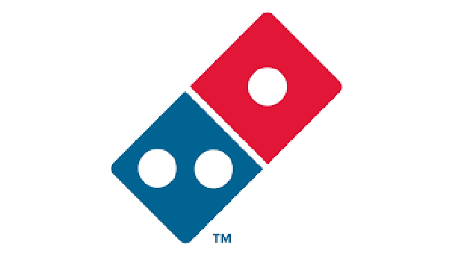
The founders of Domino’s originally intended to add a dot to the dominos in the company’s emblem each time a new store opened, but they never anticipated the pizza business would become as large as it has. The three dots in the company’s emblem now stand in for the three initial sites because the business rapidly outgrew its ability to perform such a thing. Another excellent illustration of a logo with hidden significance.
25. Evernote
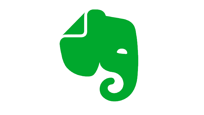
There are several pictures and messages concealed inside the Evernote logo. There is the elephant first. Elephants are renowned for having excellent memories. Evernote’s goal is to prevent forgetfulness. The elephant’s ear is also folded over like a post-it note.
26. Hershey’s Kisses
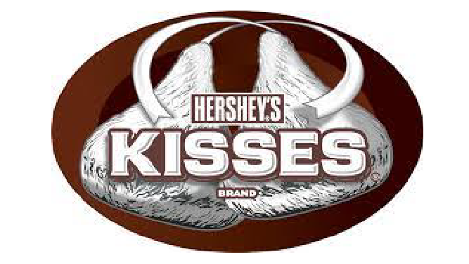
The Hershey Company, known for its chocolate and properly themed amusement park, Hersheypark, has a secret emblem on their Hershey’s Kisses product: an additional Kiss. You may see a Hershey’s Kiss baked into the logo between the letters “K” and “I” if you turn your head to the left. Some claim that there are 3 Hershey Kisses in this picture. There is a Hershey Kiss shape tucked away between the ‘K’ and the ‘I’.
Conclusion
There are hidden meanings in many logos that we see every day, and some of them are quite clever. It’s amazing what some designers can convey with a few simple shapes and colors. Take a look at these 27 logos and see if you can spot the hidden meanings. Visit Artmeet.my for more info.