Della's JGDC Logo Design #1

Description
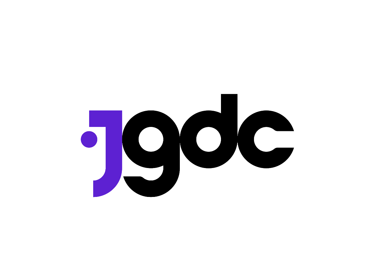
This logo is designed based on a circle, which shall relate most to the word 'community' as what JGDC is. The letters are specially formed through the use of circles and positioned close to each other to introduce a continuity and connection in the logo.
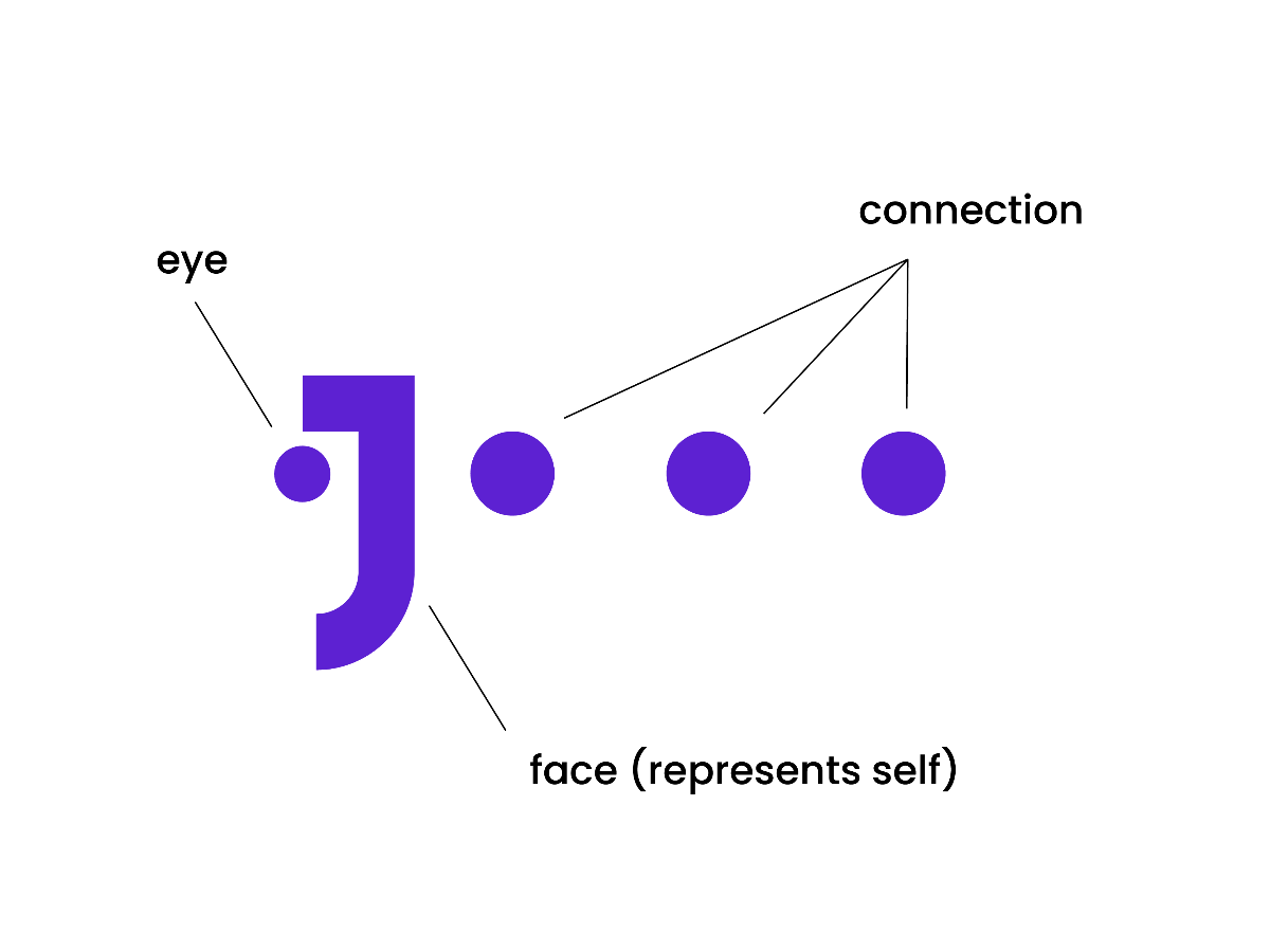
The unique feature of this logo is the alignment of small circles in the middle from the left to the right side, in which there are 4 in total (the first is the purple one, while the rest are the counters of the letters 'g,d,c'). These circles represent the connection between peers that are made within the community. While the first circle on the left side is purposely made smaller than the rest, it symbolizes a growth. On the other hand, it forms a face with the letter 'j' if you look closer. This face represents the junior graphic designers individually as one who seeks to improve through this platform.
Lastly, the logo has only two colors, namely purple and black. Considering JGDC will be a part of Artmeet itself, reusing the exact purple color will help people in recognizing this. Hence, in this case, the purple is used to emphasize the 'face' element on the logo, which represents the young graphic designers. As for the color black, it shall give a more professional look to the community.
For clearer view of this logo, please refer to the AI file.
Description
This logo is designed based on a circle, which shall relate most to the word 'community' as what JGDC is. The letters are specially formed through the use of circles and positioned close to each other to introduce a continuity and connection in the logo.
The unique feature of this logo is the alignment of small circles in the middle from the left to the right side, in which there are 4 in total (the first is the purple one, while the rest are the counters of the letters 'g,d,c'). These circles represent the connection between peers that are made within the community. While the first circle on the left side is purposely made smaller than the rest, it symbolizes a growth. On the other hand, it forms a face with the letter 'j' if you look closer. This face represents the junior graphic designers individually as one who seeks to improve through this platform.
Lastly, the logo has only two colors, namely purple and black. Considering JGDC will be a part of Artmeet itself, reusing the exact purple color will help people in recognizing this. Hence, in this case, the purple is used to emphasize the 'face' element on the logo, which represents the young graphic designers. As for the color black, it shall give a more professional look to the community.
For clearer view of this logo, please refer to the AI file.
Comments (0)
No more comments found
No more comments found