Tk's Design #1
Description
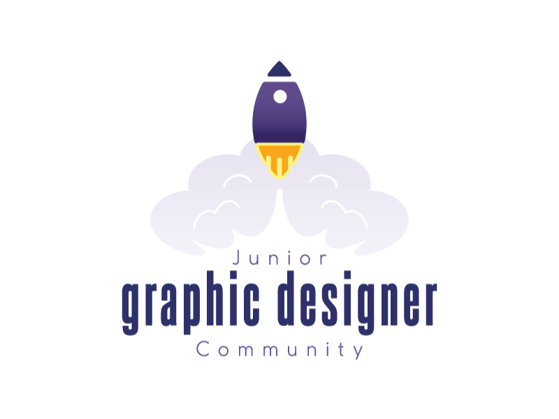
The logo is inspired by a rocket. The rocket is designed to have its appearance double up as a brush, which represents drawing, an important skill in graphic designers. The rocket is positioned in a way to resembles it launched mid air from bottom to top, symbolize our creations and values skyrocketed up, which used to describe those aspects are the most stand out among to other things, such as mindsets and people. It also symbolize we graphic designers dare to earn what it’s right to us by making ourselves go further up. The cloud behind designed to have resemblance of a brain, which represents brainstorming, an important aspect to graphic designers. The term graphic designer designed purposely to make it larger in order to make people remember this professions.
Description
The logo is inspired by a rocket. The rocket is designed to have its appearance double up as a brush, which represents drawing, an important skill in graphic designers. The rocket is positioned in a way to resembles it launched mid air from bottom to top, symbolize our creations and values skyrocketed up, which used to describe those aspects are the most stand out among to other things, such as mindsets and people. It also symbolize we graphic designers dare to earn what it’s right to us by making ourselves go further up. The cloud behind designed to have resemblance of a brain, which represents brainstorming, an important aspect to graphic designers. The term graphic designer designed purposely to make it larger in order to make people remember this professions.
Comments (0)
No more comments found
No more comments found