Junior Onwards!

Description
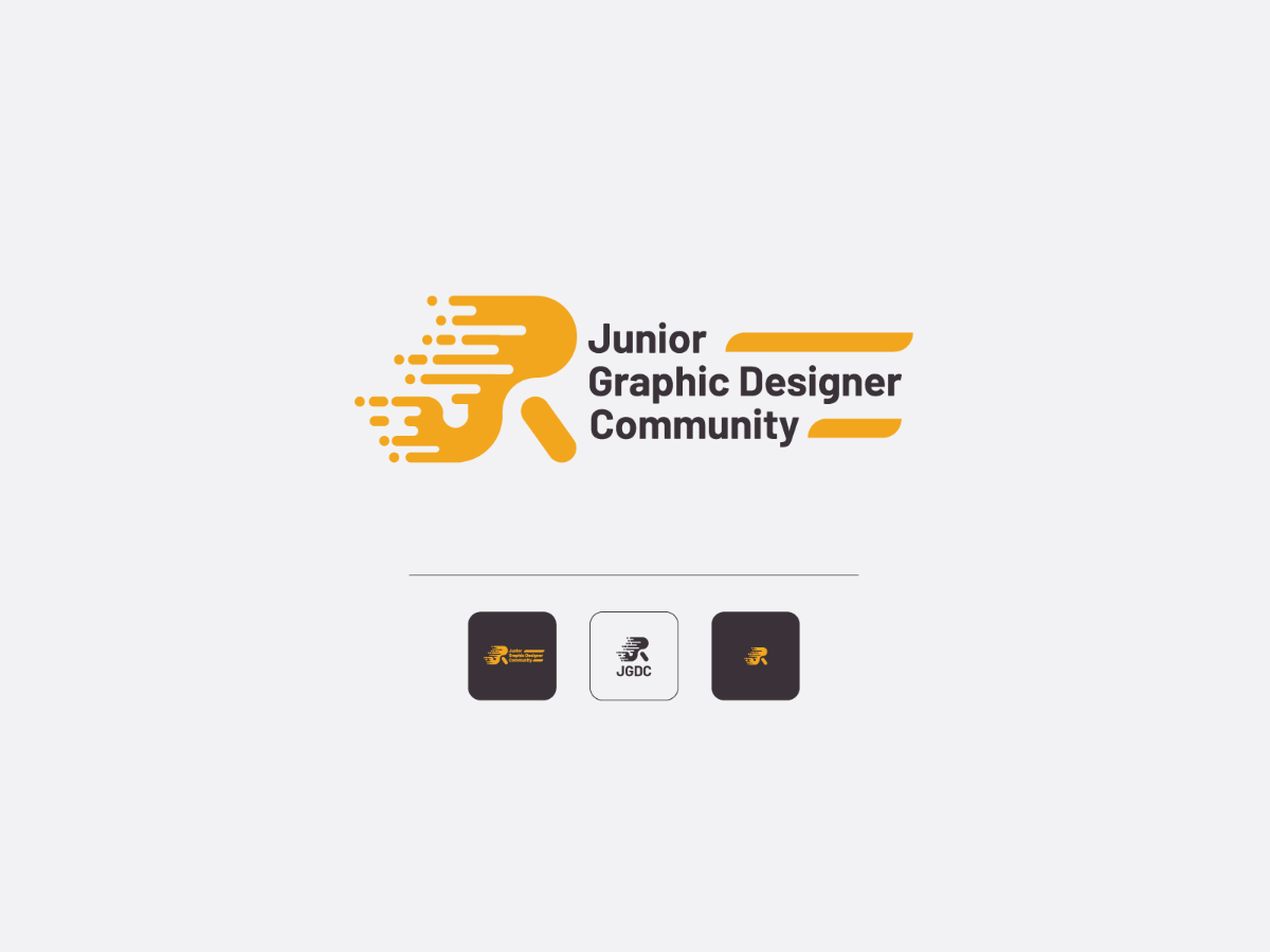
The logo is a lettermark of JR which emphasizes Junior in JGDC.
This JR symbolizes the level of graphic designer in this community. I choose "Junior" to be highlighted as the JGDC's core value stated this community are offering alot of new knowledge and guidance for the Junior level Graphic Designer.
Color is in Marigold Orange are well blended with the brand of Artmeet. I think this logo can be used on so many platforms and can be straightaway recognizable as it has its SIMPLE and DISTINCTIVE criteria. I believe that to grasp the attention of newcomers to the graphic design world is to introduce a brand with a modern-looking logo. Young and passionate about Graphic Design surely will be attracted to my proposed logo.
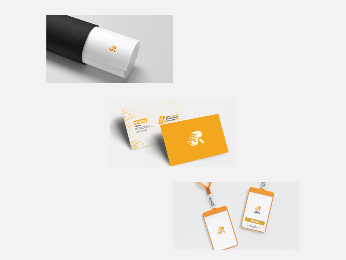
These Logo can be described as a RESPONSIVE logo. This is because from the Master Logo we can breakdown into smaller and smaller logo symbols to be used at any different printable or digital size and yet it is still RECOGNIZABLE. Either to be placed on a T-Shirt or other merchandise as Logo Only or can be Full Logo with Name ( for name cards or corporates platforms). This allows any merchandise produced by the Community will be treated as TRUSTED and WORTHY to buy as the modern logo design are MINIMALIST and INTERESTING.
This JR symbolizes the level of graphic designer in this community. I choose "Junior" to be highlighted as the JGDC's core value stated this community are offering alot of new knowledge and guidance for the Junior level Graphic Designer.
Color is in Marigold Orange are well blended with the brand of Artmeet. I think this logo can be used on so many platforms and can be straightaway recognizable as it has its SIMPLE and DISTINCTIVE criteria. I believe that to grasp the attention of newcomers to the graphic design world is to introduce a brand with a modern-looking logo. Young and passionate about Graphic Design surely will be attracted to my proposed logo.
These Logo can be described as a RESPONSIVE logo. This is because from the Master Logo we can breakdown into smaller and smaller logo symbols to be used at any different printable or digital size and yet it is still RECOGNIZABLE. Either to be placed on a T-Shirt or other merchandise as Logo Only or can be Full Logo with Name ( for name cards or corporates platforms). This allows any merchandise produced by the Community will be treated as TRUSTED and WORTHY to buy as the modern logo design are MINIMALIST and INTERESTING.
Description
The logo is a lettermark of JR which emphasizes Junior in JGDC.
This JR symbolizes the level of graphic designer in this community. I choose "Junior" to be highlighted as the JGDC's core value stated this community are offering alot of new knowledge and guidance for the Junior level Graphic Designer.
Color is in Marigold Orange are well blended with the brand of Artmeet. I think this logo can be used on so many platforms and can be straightaway recognizable as it has its SIMPLE and DISTINCTIVE criteria. I believe that to grasp the attention of newcomers to the graphic design world is to introduce a brand with a modern-looking logo. Young and passionate about Graphic Design surely will be attracted to my proposed logo.
These Logo can be described as a RESPONSIVE logo. This is because from the Master Logo we can breakdown into smaller and smaller logo symbols to be used at any different printable or digital size and yet it is still RECOGNIZABLE. Either to be placed on a T-Shirt or other merchandise as Logo Only or can be Full Logo with Name ( for name cards or corporates platforms). This allows any merchandise produced by the Community will be treated as TRUSTED and WORTHY to buy as the modern logo design are MINIMALIST and INTERESTING.
Comments (0)
No more comments found
No more comments found