JGDC: The Creative Challenger.
Description
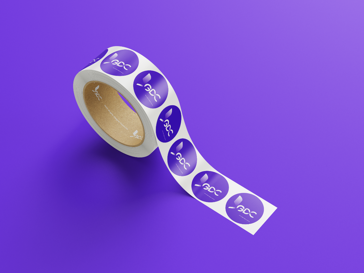
JGDC, Junior Graphic Designer Community, with junior as the keyword (also as challenging: understanding self-values and getting a better salary), graphic design as creativity: improving personal capabilities and soft skills, and community as unity: connecting with peers to exchange ideas and insights easily, as the sole concept of my design.
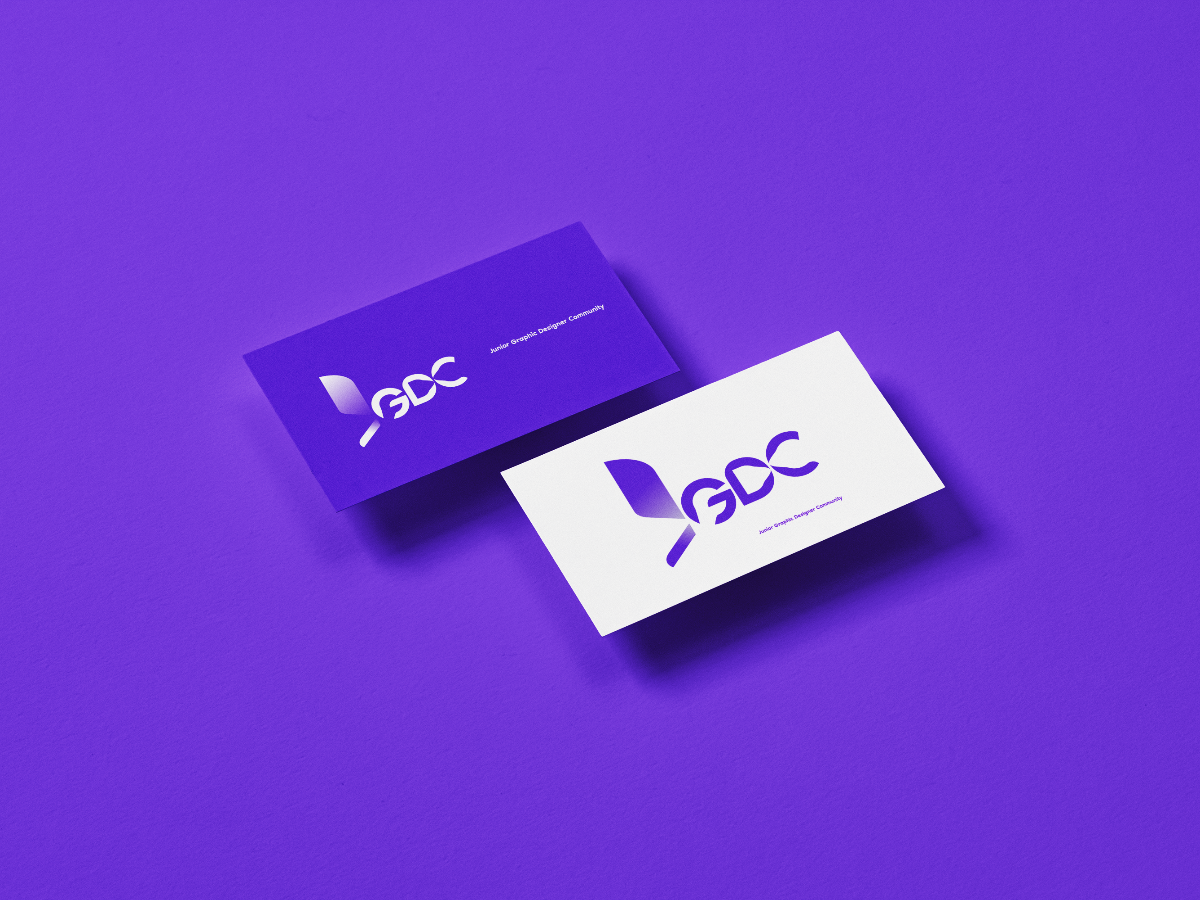
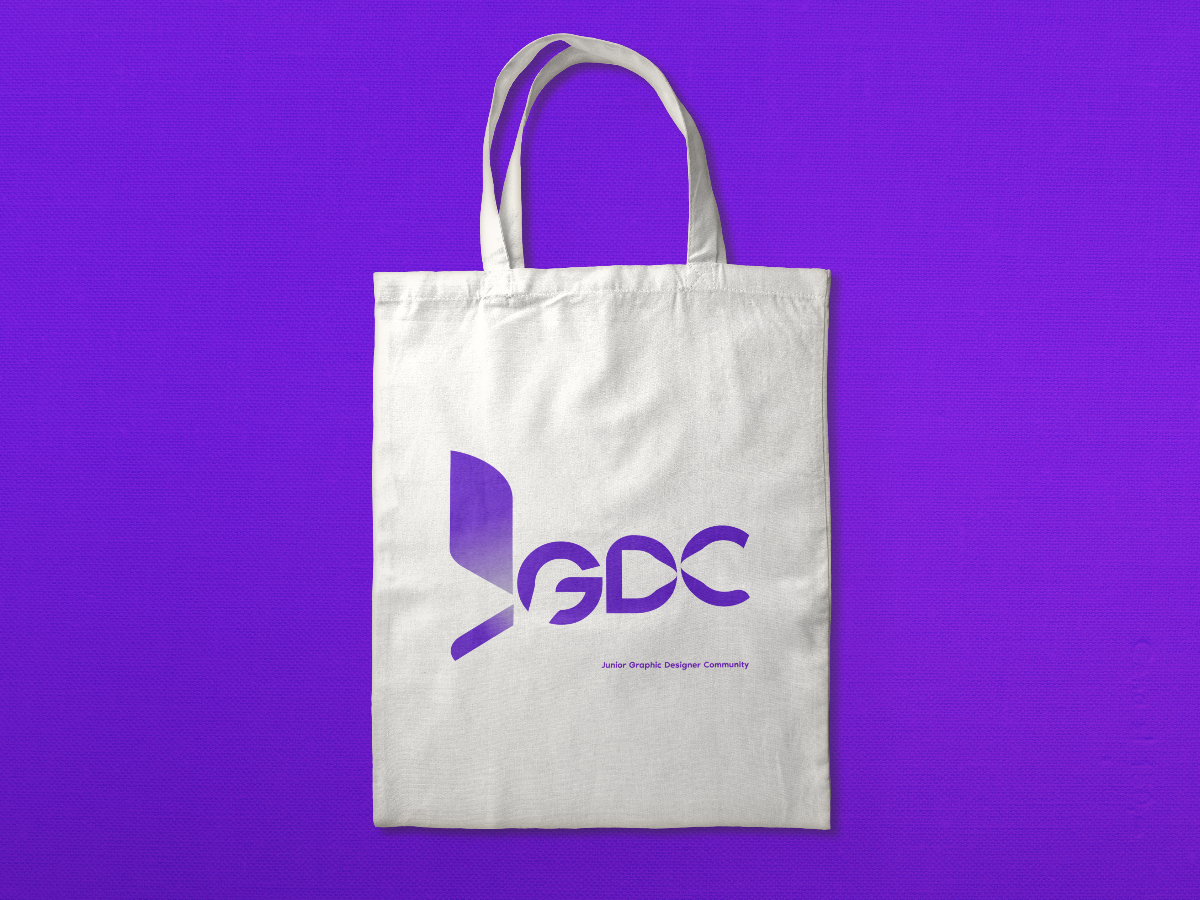
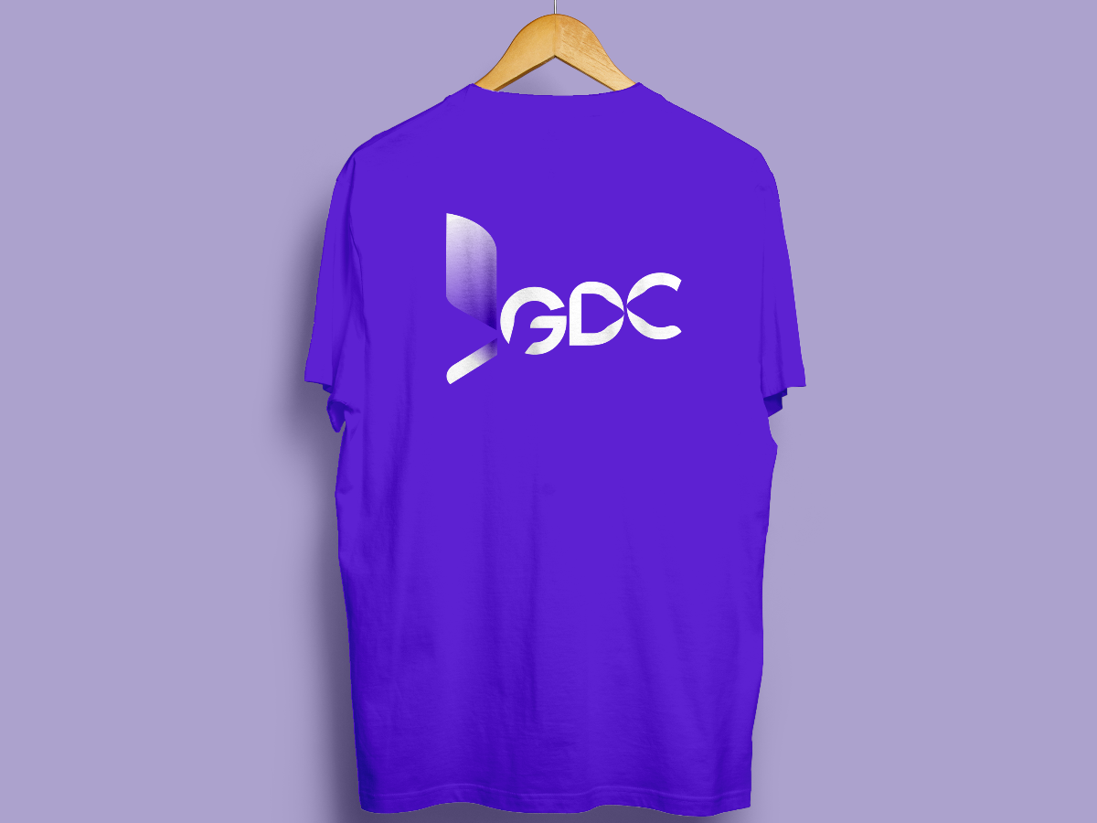
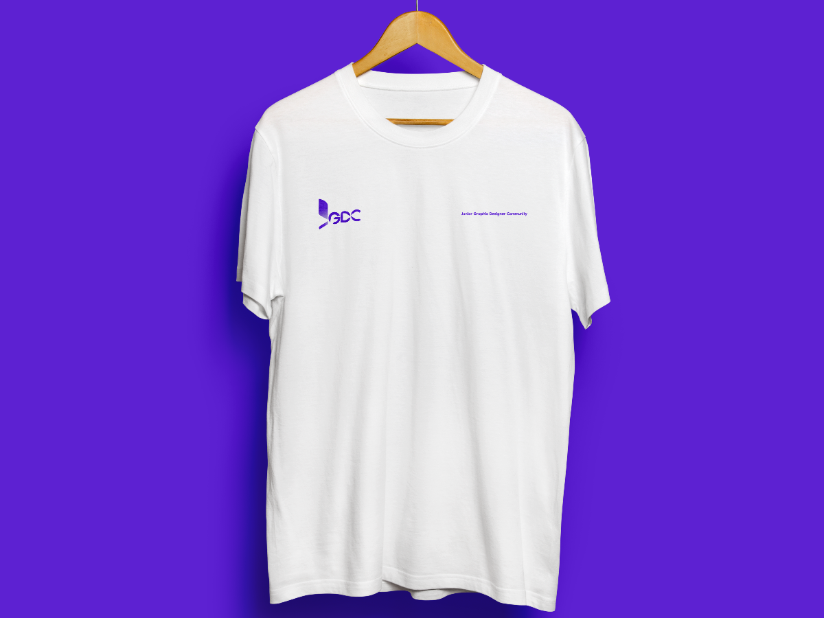
In Chinese, as the word "circle"/"round" (圆) stands for unity (团圆), I used a unique grid with many combined circles as the foundation of my logo (unity is the foundation of a community). And with the reconstructed typeface (Noir Pro Medium), I created a logo with unique curves to stick to my concept idea, round (unity), of my design and still keep the simplicity and timeless feel of the logo.
As "junior" acts as the keyword, I specially designed the letter J and added a gradient effect to it. To further clarify the concept of challenge and creativity, you will notice the rising motion of the logo, which clearly defines the ideas of improving and understanding self-values and getting a better salary.
The Creative Challenger reflects the 3 sole concepts of JGDC, which literally means a united group of creative and challenging junior designers.
(The color of the design images may seem different probably due to bugs or highlights/shadows. You may refer to the color code of the design in the AI file.)
Description
JGDC, Junior Graphic Designer Community, with junior as the keyword (also as challenging: understanding self-values and getting a better salary), graphic design as creativity: improving personal capabilities and soft skills, and community as unity: connecting with peers to exchange ideas and insights easily, as the sole concept of my design.
In Chinese, as the word "circle"/"round" (圆) stands for unity (团圆), I used a unique grid with many combined circles as the foundation of my logo (unity is the foundation of a community). And with the reconstructed typeface (Noir Pro Medium), I created a logo with unique curves to stick to my concept idea, round (unity), of my design and still keep the simplicity and timeless feel of the logo.
As "junior" acts as the keyword, I specially designed the letter J and added a gradient effect to it. To further clarify the concept of challenge and creativity, you will notice the rising motion of the logo, which clearly defines the ideas of improving and understanding self-values and getting a better salary.
The Creative Challenger reflects the 3 sole concepts of JGDC, which literally means a united group of creative and challenging junior designers.
(The color of the design images may seem different probably due to bugs or highlights/shadows. You may refer to the color code of the design in the AI file.)
Comments (0)
No more comments found
No more comments found