Janice Chaw's Design #1
Description
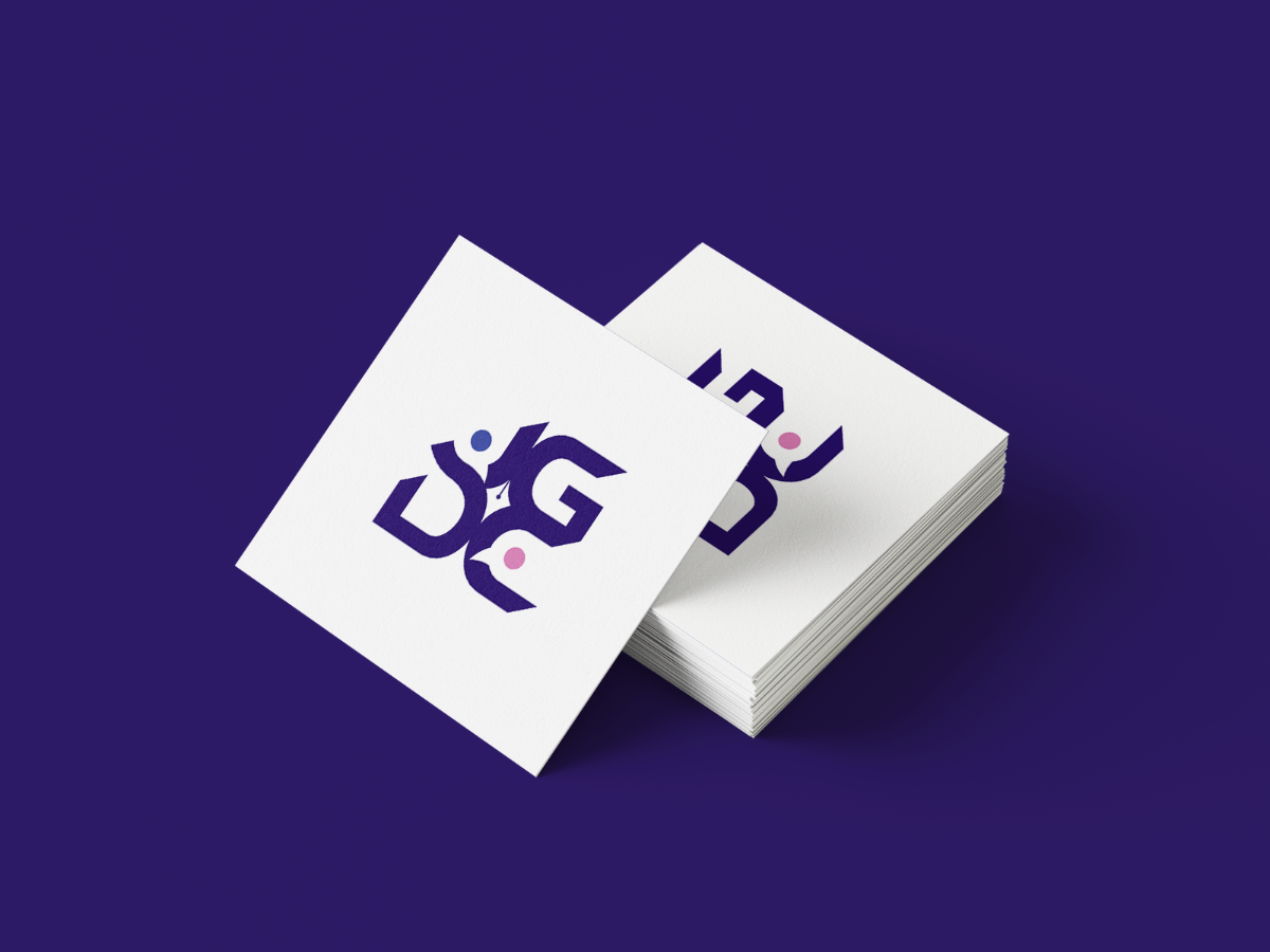
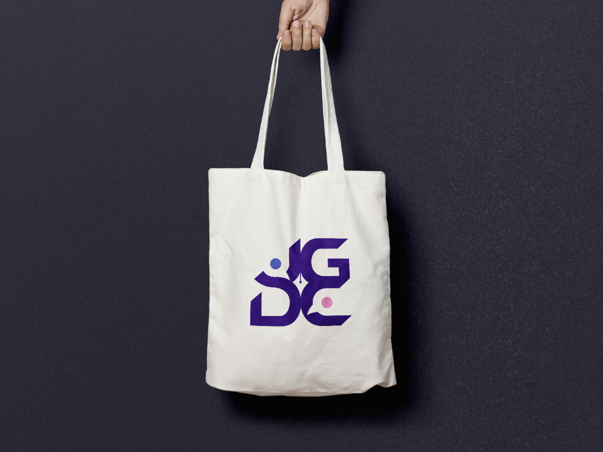
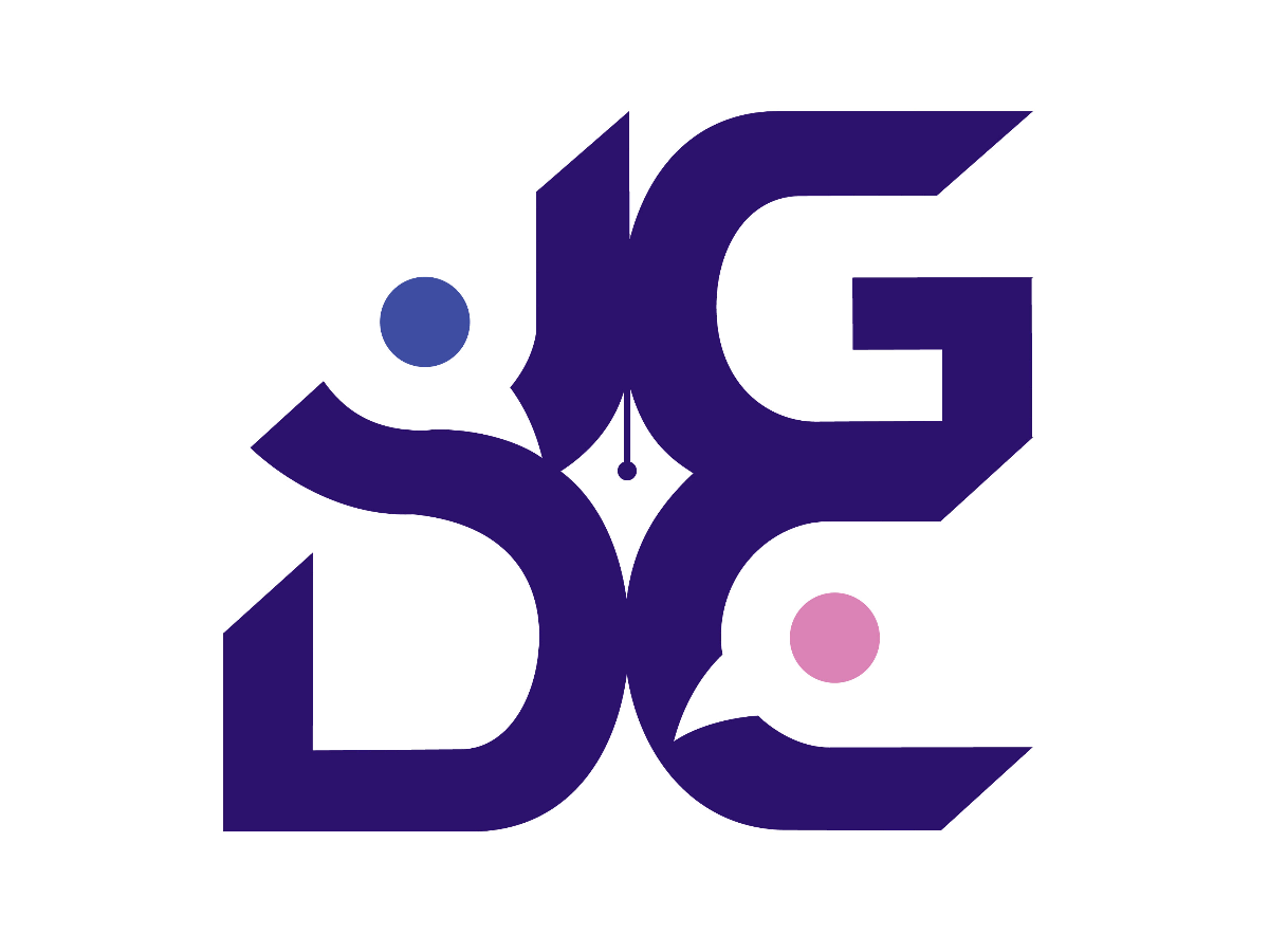
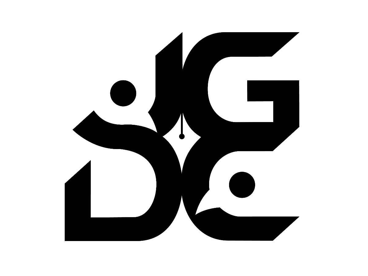
The logo formation originates from the abbreviation of "Junior Graphic Design Community". Being easily recognizable, it effectively streamlines the brand to be adopted across the marketing materials or channels. It utilizes the initials J, G, D, and C, combining them into a rectangle "community" to represent the stability of emotional (understanding self-values) and salary income.
The "togetherness" of each letter symbolizes the design community's unity and teamwork. Besides adding dynamic to the logo, each character's slanting, pointed edges signify the exponential growth of personal capabilities and soft skills of the young designers by joining this community. The san serif typeface provides a fun and playful ambient. The composition of the alphabet is like puzzle pieces where they can connect and build a complete picture.
The positive logo version illustrates blue and pink "faces" as two human silhouettes denoting male and female designers. Purple is the primary colour, a combination of blue and pink, that symbolizes imagination and creativity. It also facilitates the engagement in UN Sustainable Development Goals (SDG) 5, Gender Equality. The negative space indicates a pen tool symbol in the centre and two birds in the letter J and C. Lastly, the birds symbolize freedom of mind that encourage designers to connect and exchange creative ideas.
Description
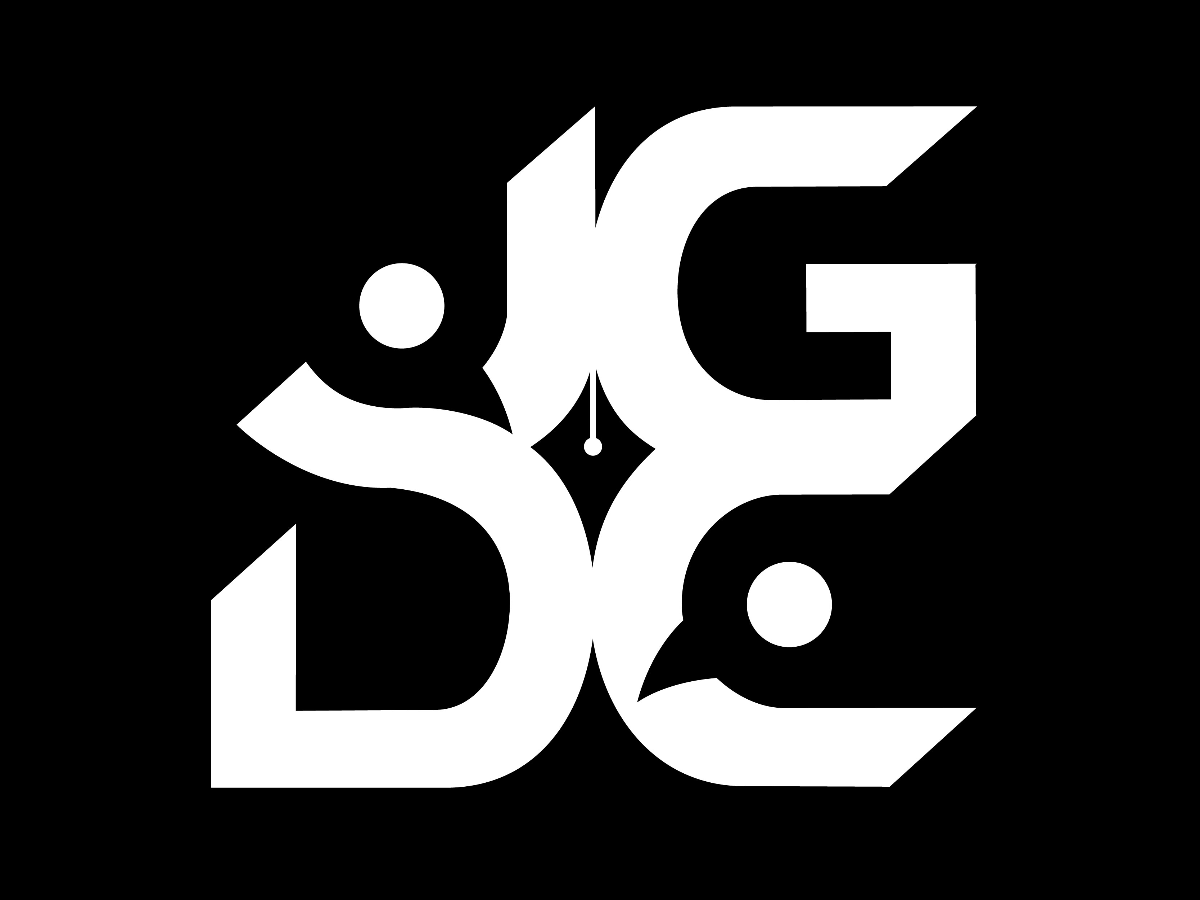
The logo formation originates from the abbreviation of "Junior Graphic Design Community". Being easily recognizable, it effectively streamlines the brand to be adopted across the marketing materials or channels. It utilizes the initials J, G, D, and C, combining them into a rectangle "community" to represent the stability of emotional (understanding self-values) and salary income.
The "togetherness" of each letter symbolizes the design community's unity and teamwork. Besides adding dynamic to the logo, each character's slanting, pointed edges signify the exponential growth of personal capabilities and soft skills of the young designers by joining this community. The san serif typeface provides a fun and playful ambient. The composition of the alphabet is like puzzle pieces where they can connect and build a complete picture.
The positive logo version illustrates blue and pink "faces" as two human silhouettes denoting male and female designers. Purple is the primary colour, a combination of blue and pink, that symbolizes imagination and creativity. It also facilitates the engagement in UN Sustainable Development Goals (SDG) 5, Gender Equality. The negative space indicates a pen tool symbol in the centre and two birds in the letter J and C. Lastly, the birds symbolize freedom of mind that encourage designers to connect and exchange creative ideas.
Comments (0)
No more comments found
No more comments found