A logo is an instantly identifiable image that stands in for a business or item. It serves as a visual shorthand for conveying the fundamental principles and values of a company. Therefore, a branding plan of any organisation must include logos. When creating a logo, it’s crucial to take design factors like value into account. Value refers to a color’s brightness or blackness. It could add contrast and intrigue to the eye. However, value in logo design could convey a message, enhance visual appeal, or evoke a feeling of depth.
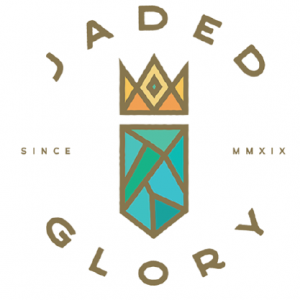
Different values of tortoise blue create different sensations depending on the amount of light that is reflecting off of the blue. A very light value will appear to be almost white while a very dark value will appear to be almost black. In between, different shades of tortoise blue can create a feeling of serenity, calmness, or peace.
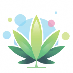
Green is the color of nature and is often used in decorating because it gives the sensation of being outdoors. It is also the color of life and growth. Dark green is a symbol of prosperity, power, and money. Therefore, it is often to be use in corporate logos and is seen as a color of stability and endurance. In the another hand, light green is more to be nature, health, and healing. It is a calming color that is often used in hospitals and doctor’s offices.

Red is the color of passion and excitement. It is also the color of danger and warning. Different values of red can create different sensations. A deep, rich red can be luxurious and sensual. A bright, cherry red can be fun and festive. A light, pinkish red can be romantic and delicate. And a bold, fiery red can be energetic and assertive. No matter what the value, red is always a powerful color that commands attention.
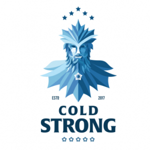
Different values of blue can create a sense of coolness because blue is generally associated with the color of water and the sky. While a deeper blue may conjure images of the ocean’s depths, a lighter blue might convey a sense of tranquilly. Blue is also often used to represent cold temperatures, so a very light blue can make a person feel chilly.

Value is one of the elements of design that helps to create a sense of depth. Value is the lightness or darkness of a color. A color with a high value is darker than a color with a low value. A color with a low value is called a light color, while a color with a high value is called a dark color. Value can also be used to create the illusion of depth on a two-dimensional surface. The appearance of depth is produced by using light colours in the foreground and dark hues in the backdrop.
Conclusion
The sample logos shows how value could be use as a design element. While the opposing colours generate a feeling of visual appeal, the light and dark hues give the image depth and perspective. The final result is a distinctive and memorable logo.
Read more about Elements of Design here:
- Elements of Design That You Should Understand In The Beginning
- Ultimate Guide To Understand Elements Of Design : Lines
- Elements #1: Lines – Make Good Design With These Consideration
- Use of Lines as a Design Element and Its Importance
- Elements #1 Lines – Learn from these powerful logo
- Elements Of Design #2: Understand What Shapes Really About
- Think Of These When Making Perfect Designs With Shapes
- Elements #2 : The Important Role Of Shapes in Perfect Design
- Elements #2: Effective Logos with Shapes As Good Examples
- Elements #3 – What Space Really About In Design?
- Element #3 – Challenges To Create Beautiful Design With Space
- Uses And Importance of Space In Making Beautiful Design
- Space As Design Elements: Five Examples Of Powerful Logos
- Elements #4: Ultimate Introduction to Color In Design
- Concern Of Using Color When Creating Attractive Designs
- Elements #4 : The Important Roles Of Color In Your Perfect Design
- The Successful Logo Example That Makes Use Of Color Is.
- Ultimate Guide For Elements Of Design: Form
- Elements #5 – Think about These When Design Using Form
- The Successful Logo Example That Using Elements Of Design: Form
- Ultimate Guide for Elements of Design: Texture
- Elements #6: When Applying Texture, Think about These All
- Elements #6: Great Examples of Texture Logo That You Can Learn
- Ultimate Guide for Elements of Design: Value
- When Applying Elements Of Design – Value, Keep These In Your Mind