Typography is an important part of any design project, as it can help to create a visual hierarchy and draw attention to the most important elements. Good typography can make a design look professional and polished, while bad typography can make a design look sloppy and unprofessional. In this article, we will discuss some tips for effective typography that everyone should know.

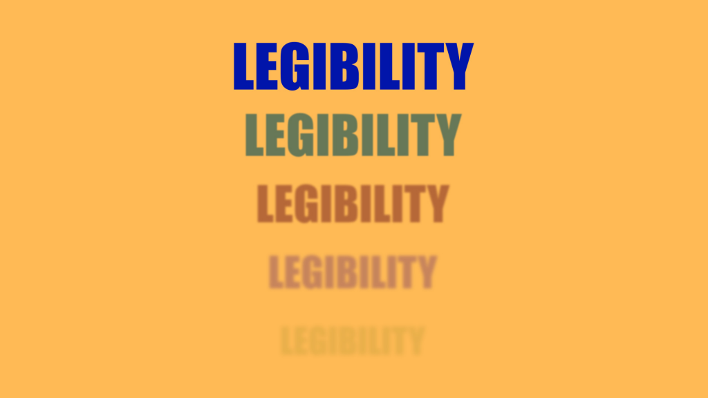
Use Legible font
Legible fonts are designed to be easily distinguishable from one another, making it easier for readers to quickly identify the different characters and words. This is especially important when it comes to longer pieces of text, as it helps to reduce the amount of time it takes to read and comprehend the content.
Apart of that, legible fonts can help to create a sense of professionalism and trustworthiness, as they are often associated with reliable sources of information. All of these factors make legible fonts an essential part of typography.
Establish Hierachy
Hierarchy helps to create a visual order that guides the viewer’s eye through the design. It helps to emphasize the most important elements and draw attention to the key messages. By using different typefaces, sizes, weights, and colors, designers can create a hierarchy that will help viewers to quickly understand the content. Additionally, hierarchy can be used to create a sense of harmony and balance within the design itself, allowing viewers to quickly identify the most important elements.

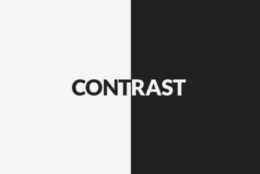
Use Contrast
Using contrast in typography is a great way to draw attention to certain elements of a design. Contrast can also be used to create a sense of balance and harmony in a design, as well as to create a sense of movement and energy. Besides that, it can also be used to create a sense of depth and dimension in a design, as well as to create a sense of drama and excitement. In short, using contrast in typography is an effective way to create visual interest and to draw attention to important elements of a design.
Limit Length Line
Limit length line is an important concept in typography that helps to create a visually pleasing and easy to read layout. Limit length line is the practice of setting a maximum length for each line of text in a document. This helps to ensure that the text is easy to read and that the lines of text are not too long or too short. It also helps to create a consistent look and feel throughout the document.

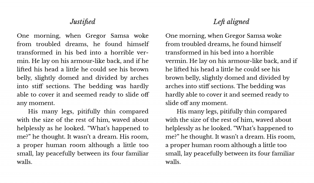
Avoid Justifying Texts
Avoiding justification is a great way to improve the overall look and feel of your typography. Justified text is when all of the lines of text are aligned to the left and right margins, creating a straight line of text. This can be aesthetically pleasing, but it can also create some problems. Justified text can create large gaps between words, which can be distracting and make the text difficult to read.
Use Emphasis Sparingly
Emphasis can be used to draw attention to certain words or phrases, but if it is used too often, it can become overwhelming and detract from the overall design. When used correctly, emphasis can be a powerful tool to help guide the reader’s eye and create a sense of hierarchy. However, if it is used too often, it can become distracting and detract from the overall design.
Conclusion
Typography is an important part of any design project, and it can make or break the overall look and feel of the design. With a little practice and experimentation, you can create beautiful typography that will make your design stand out from the crowd. By understanding the basics of typography and applying the tips outlined in this article, you can create stunning designs that will make your work stand out. Do you know how to present your designs? Check it out here to learn about it today!

