Dough and Dolce Brand Identity
Submitted in
Unbox Exhibition 2023 by UTAR DMDA

Description
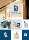
In my logo design, the sourdough bread has been modified into the shape of the letter ’D’. The ‘D’ shape represents the brand name as the name of the brand starts with ‘D’. The wheat has been placed into the sourdough bread shape and represents one of the elements to make sourdough bread. Sassoon Infant Std Bold typeface has been used in the brand name as it is easier for the audience to read through. It gives a sense of between formal and informal and the flow of the tail of the letter gives a sense of relaxation. The colour scheme of the brand has been created from salt colour, flour colour and dark blue colour. These colours are represented by the ingredients of making sourdough bread which is salt, flour and water.
Description
In my logo design, the sourdough bread has been modified into the shape of the letter ’D’. The ‘D’ shape represents the brand name as the name of the brand starts with ‘D’. The wheat has been placed into the sourdough bread shape and represents one of the elements to make sourdough bread. Sassoon Infant Std Bold typeface has been used in the brand name as it is easier for the audience to read through. It gives a sense of between formal and informal and the flow of the tail of the letter gives a sense of relaxation. The colour scheme of the brand has been created from salt colour, flour colour and dark blue colour. These colours are represented by the ingredients of making sourdough bread which is salt, flour and water.
Comments
Please login to post comment
Login
2
comments
Very good and creative design
Share
Reply
Such a cute design!
Share
Reply
No more comments found
No more comments found
Cast a vote
You're required to identify yourself to ensure the integrity of your votes.
Login to your existing Artmeet account:
Login to your existing Artmeet account:
Email or username should not be empty.
Password should not be empty.
Password must be at least 6 characters.
Password should not be longer than 20 characters.