Elton's Design #1
Submitted in
Unbox Exhibition 2023 by UTAR DMDA
Description
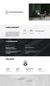
Supernormal design studio is an interior design firm that has been in the interior design industry since 7 years ago (2016). Currently they are accepting residential and commercial project. Supernormal this name was inspired by Jasper Morrisson and Naoto Fukasawa. They do not confine ideas by spaces and they connect space and human. Supernormal are here to create inspiring, functional, and personalized spaces that reflects to client unique personalities and they would like to transform spaces into luxurious and comfortable spaces that enhance the lives for their clients.
For the concept of this rebranding project, since they accepting two different type of project, so I create an icon for them to let them be easier to recognize. The Supernormal icon have upper section and bottom section, the upper section is representing the commercial project while the bottom section is for the residential project. The upper section is form by the word 'S' while the bottom is form by word 'N'. To let the bottom part look more housing feel, I apply a house icon as a negative space inside the 'N' words. I choose to use the gray colour monochrome because Supernormal is more focusing on minimalism design, also they will apply lot of gray texture into their design. The upper part is in the lighter gray tone because of the higher the building are, they receive more light, this is to represent those building as the commercial project.
For the concept of this rebranding project, since they accepting two different type of project, so I create an icon for them to let them be easier to recognize. The Supernormal icon have upper section and bottom section, the upper section is representing the commercial project while the bottom section is for the residential project. The upper section is form by the word 'S' while the bottom is form by word 'N'. To let the bottom part look more housing feel, I apply a house icon as a negative space inside the 'N' words. I choose to use the gray colour monochrome because Supernormal is more focusing on minimalism design, also they will apply lot of gray texture into their design. The upper part is in the lighter gray tone because of the higher the building are, they receive more light, this is to represent those building as the commercial project.
Description
Supernormal design studio is an interior design firm that has been in the interior design industry since 7 years ago (2016). Currently they are accepting residential and commercial project. Supernormal this name was inspired by Jasper Morrisson and Naoto Fukasawa. They do not confine ideas by spaces and they connect space and human. Supernormal are here to create inspiring, functional, and personalized spaces that reflects to client unique personalities and they would like to transform spaces into luxurious and comfortable spaces that enhance the lives for their clients.
For the concept of this rebranding project, since they accepting two different type of project, so I create an icon for them to let them be easier to recognize. The Supernormal icon have upper section and bottom section, the upper section is representing the commercial project while the bottom section is for the residential project. The upper section is form by the word 'S' while the bottom is form by word 'N'. To let the bottom part look more housing feel, I apply a house icon as a negative space inside the 'N' words. I choose to use the gray colour monochrome because Supernormal is more focusing on minimalism design, also they will apply lot of gray texture into their design. The upper part is in the lighter gray tone because of the higher the building are, they receive more light, this is to represent those building as the commercial project.
For the concept of this rebranding project, since they accepting two different type of project, so I create an icon for them to let them be easier to recognize. The Supernormal icon have upper section and bottom section, the upper section is representing the commercial project while the bottom section is for the residential project. The upper section is form by the word 'S' while the bottom is form by word 'N'. To let the bottom part look more housing feel, I apply a house icon as a negative space inside the 'N' words. I choose to use the gray colour monochrome because Supernormal is more focusing on minimalism design, also they will apply lot of gray texture into their design. The upper part is in the lighter gray tone because of the higher the building are, they receive more light, this is to represent those building as the commercial project.
Comments
Please login to post comment
Login
0
comment
No more comments found
No more comments found
Cast a vote
You're required to identify yourself to ensure the integrity of your votes.
Login to your existing Artmeet account:
Login to your existing Artmeet account:
Email or username should not be empty.
Password should not be empty.
Password must be at least 6 characters.
Password should not be longer than 20 characters.