Branding for Simple Warehouse
Submitted in
Unbox Exhibition 2023 by UTAR DMDA

Description
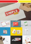
The Simple Warehouse logo is designed to capture the people that we provided the products with value of money which is worth of the price and quality.
The frame of the logo uses a price tag symbol to represent the value of money of the products. Else, the yellow frame which is the symbol of dialogue represent the good services to the customers.
The brand name uses a customize typeface with a bold shape of ‘SIMPLE’ and the ‘WAREHOUSE’ is using the typeface of Helvetica. This is because the kind of convenience store with valueble price of products is suitable to use sans serif font as their name. Besides, it is also match the concept of simple for the typeface of brand name.
Description
The Simple Warehouse logo is designed to capture the people that we provided the products with value of money which is worth of the price and quality.
The frame of the logo uses a price tag symbol to represent the value of money of the products. Else, the yellow frame which is the symbol of dialogue represent the good services to the customers.
The brand name uses a customize typeface with a bold shape of ‘SIMPLE’ and the ‘WAREHOUSE’ is using the typeface of Helvetica. This is because the kind of convenience store with valueble price of products is suitable to use sans serif font as their name. Besides, it is also match the concept of simple for the typeface of brand name.
The frame of the logo uses a price tag symbol to represent the value of money of the products. Else, the yellow frame which is the symbol of dialogue represent the good services to the customers.
The brand name uses a customize typeface with a bold shape of ‘SIMPLE’ and the ‘WAREHOUSE’ is using the typeface of Helvetica. This is because the kind of convenience store with valueble price of products is suitable to use sans serif font as their name. Besides, it is also match the concept of simple for the typeface of brand name.
Comments
Please login to post comment
Login
0
comment
No more comments found
No more comments found
Cast a vote
You're required to identify yourself to ensure the integrity of your votes.
Login to your existing Artmeet account:
Login to your existing Artmeet account:
Email or username should not be empty.
Password should not be empty.
Password must be at least 6 characters.
Password should not be longer than 20 characters.