Rebranding of BeWellTy
Submitted in
Unbox Exhibition 2023 by UTAR DMDA

Description
The main objective of rebranding BeWellTy is to establish a new brand identity that reflect the brand message and personalities.
BeWellTy is a Malaysia social enterprise founded in 2015, which helps people to live a healthy, happy and sustainable life by providing the best quality eco-friendly products. They also provided the services such as advocating sustainable lifestyle, safeguarding food safety and security, and creating entrepreneur opportunity for local community.
The concept of ‘Care Health & Environment’ or ‘Sustainable Living’ was chosen, and this approach uses minimalist design to reflect the brand's intention of reducing its carbon footprint and waste, and to attract younger audience especially female adults who conscious health and environment.
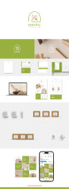
The impact of this rebranding is to give BeWellTy a more simple, clean, warm, soft and welcoming characteristic. That is why minimalism combined with line drawing style, and soft but bit vibrant warm colours are used in the art direction.
Furthermore, new logo consists with the elements such as hugging hand, love shape plant and soil. The combination of these elements has shown a plant healthy growth in a good environment, which at the same time also showing a hand caring for a heart (our health) or a plant. Thus, it symbolizes BeWellTy give us healthy and at the same time also provide betterment environment.
The main brand colours are green (Bamboo Leaf), pink (Simple Pink) and white. The green symbolizes nature, health and eco-friendly product; pink symbolizes care, warm and feminine. The other colour is the neutral colours like Black, Wood Charcoal, Zinc Dust and Frost Grey. Black is only used for printing, and other neutral colour is only used for digital text colour.
Lastly, the corporate typography is Narrenschiff and Franklein family. These fonts are soft or curve and clean to enhance the soft and minimal feeling as well as readability.
Description
The main objective of rebranding BeWellTy is to establish a new brand identity that reflect the brand message and personalities.
BeWellTy is a Malaysia social enterprise founded in 2015, which helps people to live a healthy, happy and sustainable life by providing the best quality eco-friendly products. They also provided the services such as advocating sustainable lifestyle, safeguarding food safety and security, and creating entrepreneur opportunity for local community.
The concept of ‘Care Health & Environment’ or ‘Sustainable Living’ was chosen, and this approach uses minimalist design to reflect the brand's intention of reducing its carbon footprint and waste, and to attract younger audience especially female adults who conscious health and environment.
BeWellTy is a Malaysia social enterprise founded in 2015, which helps people to live a healthy, happy and sustainable life by providing the best quality eco-friendly products. They also provided the services such as advocating sustainable lifestyle, safeguarding food safety and security, and creating entrepreneur opportunity for local community.
The concept of ‘Care Health & Environment’ or ‘Sustainable Living’ was chosen, and this approach uses minimalist design to reflect the brand's intention of reducing its carbon footprint and waste, and to attract younger audience especially female adults who conscious health and environment.
The impact of this rebranding is to give BeWellTy a more simple, clean, warm, soft and welcoming characteristic. That is why minimalism combined with line drawing style, and soft but bit vibrant warm colours are used in the art direction.
Furthermore, new logo consists with the elements such as hugging hand, love shape plant and soil. The combination of these elements has shown a plant healthy growth in a good environment, which at the same time also showing a hand caring for a heart (our health) or a plant. Thus, it symbolizes BeWellTy give us healthy and at the same time also provide betterment environment.
The main brand colours are green (Bamboo Leaf), pink (Simple Pink) and white. The green symbolizes nature, health and eco-friendly product; pink symbolizes care, warm and feminine. The other colour is the neutral colours like Black, Wood Charcoal, Zinc Dust and Frost Grey. Black is only used for printing, and other neutral colour is only used for digital text colour.
Lastly, the corporate typography is Narrenschiff and Franklein family. These fonts are soft or curve and clean to enhance the soft and minimal feeling as well as readability.
Furthermore, new logo consists with the elements such as hugging hand, love shape plant and soil. The combination of these elements has shown a plant healthy growth in a good environment, which at the same time also showing a hand caring for a heart (our health) or a plant. Thus, it symbolizes BeWellTy give us healthy and at the same time also provide betterment environment.
The main brand colours are green (Bamboo Leaf), pink (Simple Pink) and white. The green symbolizes nature, health and eco-friendly product; pink symbolizes care, warm and feminine. The other colour is the neutral colours like Black, Wood Charcoal, Zinc Dust and Frost Grey. Black is only used for printing, and other neutral colour is only used for digital text colour.
Lastly, the corporate typography is Narrenschiff and Franklein family. These fonts are soft or curve and clean to enhance the soft and minimal feeling as well as readability.
Comments
Please login to post comment
Login
0
comment
No more comments found
No more comments found
Cast a vote
You're required to identify yourself to ensure the integrity of your votes.
Login to your existing Artmeet account:
Login to your existing Artmeet account:
Email or username should not be empty.
Password should not be empty.
Password must be at least 6 characters.
Password should not be longer than 20 characters.