What the difference between typeface VS font is when it comes to typography is one of the most often asked topics. Although they can appear to be the same to the average person, there is a significant difference between the two. A font is a particular layout for letters, numerals, and other symbols. These characters are really shown or printed using a typeface. To put it another way, a typeface is how the letters are designed, while a font is what you type with. Although “typeface” and “font” are sometimes confused, they really relate to separate concepts. A font, on the other hand, refers to variants of a typeface, such as its size and weight, whereas a typeface identifies a certain style of letters. The simplest approach to comprehend this distinction is to think of typefaces as collections of fonts that share certain aesthetic characteristics.
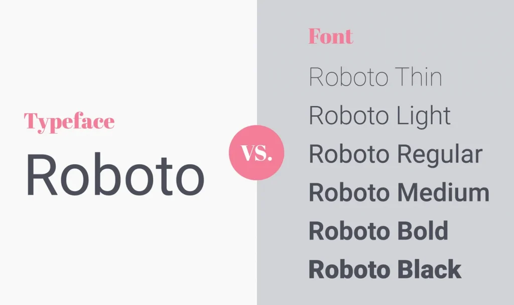
There are dozens, if not hundreds, of different typefaces available, yet there are only a few different fonts. That’s because designers produce typefaces, and they frequently produce many fonts for each typeface. For instance, the same typeface may be used for different fonts such as bold, italic, and condensed. There are several alternatives available to you when selecting a typeface for your work. After selecting a typeface, you must then select a font that serves your goal. You ought to choose a sans-serif typeface when writing something that must be simple to read. A script font is an option if you’re searching for something a little more ornamental. Making better decisions for your papers can be aided by understanding the distinction between a typeface and a font. Therefore, the next time you’re starting a new project, give it some thought as to what typeface and font would work best for you.
Typeface
The majority of the time, what we think of as a font is actually a typeface. In other words, Times New Roman, Helvetica, and Arial are typefaces rather than fonts.
A font is essentially a collection of design elements that distinguish one specific lettering style from another. This might include the serif’s presence (or absence), the letters’ proportional height, spacing, and breadth, as well as any additional decorative elements. There are several categories of type, including:
Serif Typeface
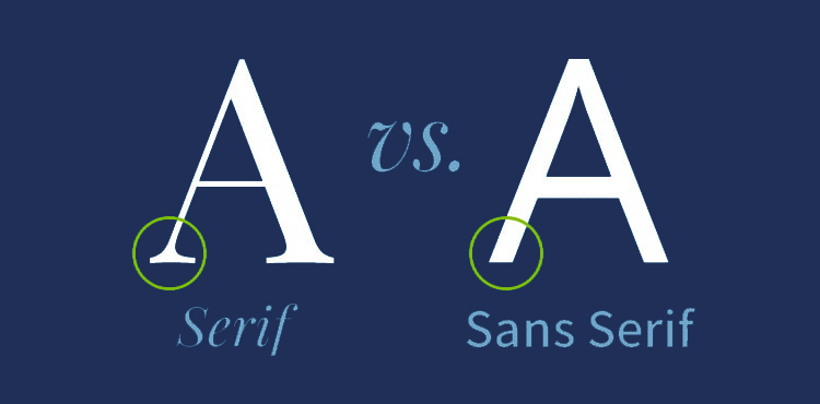
These are typefaces that include serifs, which are slight projections added to the ends of a stroke. In web design, this style tends to evoke a sophisticated and timeless feel. Perhaps the most obvious example of a serif typeface is Times New Roman. Classic and readable (but, arguably, without much character), it was originally designed in 1932 for The Times of London newspaper. Today, it’s still widely used in printed newspapers and news websites. You’ve also seen it as the default font on some of the older versions of Microsoft Word. Of course, as a web designer, Times New Roman probably isn’t your go-to. Georgia is another serif typeface that has more character and charm.
Sans Serif Typeface
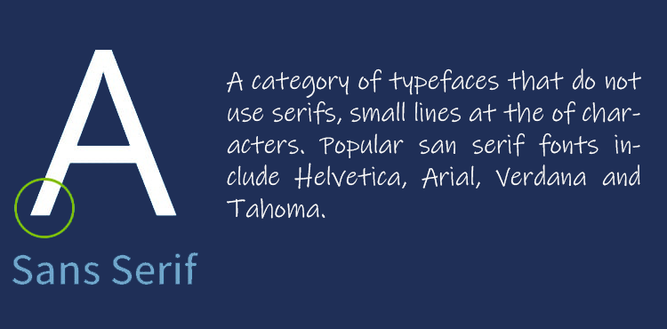
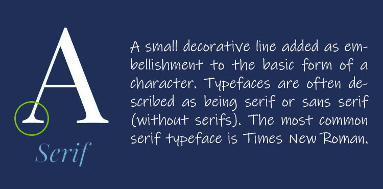
A serif is a small line attached to the end of a stroke in a letter or symbol. A typeface with serifs is called a serif typeface (or seriffed typeface). Some of the main classifications of Serif type are Old Style, Transitional, Modern, Slab Serif, Script, and Display. Serifs originated in the Latin alphabet with inscriptional lettering—words carved into stone in Roman antiquity. They were first seen in print in the 14th century. The term “serif” is from the Dutch word schreef, meaning “line” or “stroke of the pen”. The main purpose of serifs is to make letters more easily readable. For example, the small lines at the end of each stroke in the letter “T” help the eye to quickly identify the letter and its shape. The serifs of a typeface can be either bracketed or unbracketed. Bracketed serifs are characterized by a small line that curves inward at the bottom of the letter (like the “W” above). Unbracketed serifs do not have this small line (like the “T” above). The different styles of serifs can be used to create different effects. Old Style typefaces, for example, are more organic and have a humanist quality. Transitional typefaces are more formal and traditional. Modern typefaces are more geometric and have straight lines. Slab Serif typefaces are more heavy and block-like. Script typefaces are designed to mimic handwritten letters. Display typefaces are more ornate and designed for headlines and other large text. There is some debate over whether or not serifs actually improve readability. Some studies have shown that they can help with readability, while others have shown that they have no effect. In general, serifs are thought to be more easily readable in print than on a screen. This is because the resolution of screens is not high enough to render the small details of serifs.
Font
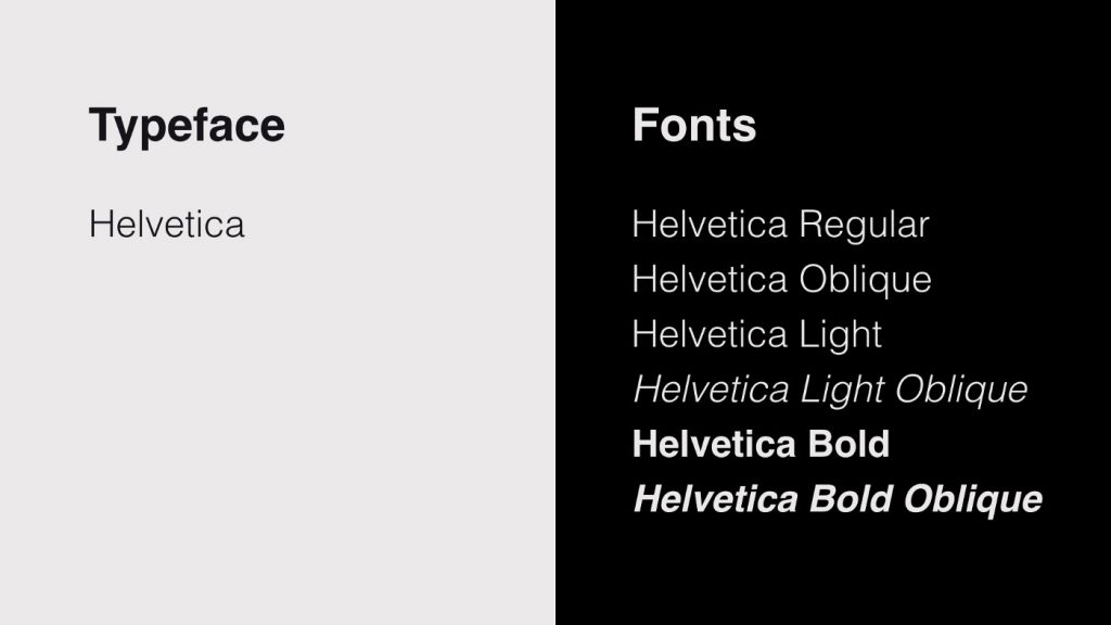
A font is a set of printable or displayable text character s in a specific style and size. The type design for a set of fonts is the typeface and variations of this design form the typeface family. Fonts are used in printing, typesetting and word processing. The main purpose of fonts is to provide the reader with a uniform experience while reading a document, by ensuring that all the characters have the same style and size.
Ways that fonts of the same typeface can vary from one another
Size
You are aware that headers and titles are frequently larger than body text? Even if the typeface is the same, technically speaking, that makes them separate typefaces. Yes, the fonts Garamond 12 pt and 16 pt are different from one another.
Weight
Helvetica Neue serves as an illustration of how typefaces can differ based on their weights even though the typeface is the same. In other words, Helvetica Neue 12 pt Bold has gradually thicker strokes than Helvetica Neue 12 pt Light, which is a separate typeface.
Letterform Width
Spacing emphasises even more the distinction between typefaces and fonts. You may use fonts to express your creativity as a web designer by enlarging or compressing them (creating more or less space between each letter). The letters are compressed when they are pressed close together. You enlarge them by setting them apart widely. Compressed, condensed, semi-condensed, narrow, regular, extended, extra extended, and enlarged letterform widths are only a few of the options. Distinct widths denote different typefaces, much like font weights do.
Italics
Similar to how various typefaces are represented by italics or romanized letters. Therefore, if I ask, “Do you enjoy pizza? ” as opposed to “Do you enjoy pizza? I’m altering the typeface on the word “you” to say.
Conclusion
Typeface and font are two terms that are often used interchangeably, but they actually refer to two different things. A typeface is a set of characters that share a common design, while a font is a file that contains the typeface. So, when you’re choosing a typeface for your project, you’re actually choosing a font file. Now that you know the difference between these two terms, you can make sure to use them correctly! Visit Artmeet.my for more reads like this.